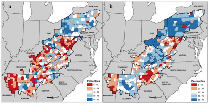
Figure 2.
County healthcare cost, coverage, and access index scores across Appalachia (from Lane et al., 2012, Health Care Costs and Access Disparities in Apppalachia, Appalachian Regional Commission). Blue represents good access, coverage, and payment compared to the national average. White indicates the County’s index score is close to the national average. Red indicates the index score is well below the national average. Panel a shows the combined index scores for cost, coverage, and access. Panel b shows the percentiles for healthcare insurance coverage only.

