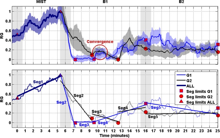
Fig 5. RG and segments.
Upper: Curves represent the normalized RG of G1 (blue) and G2 (black). The SEM of the RG is displayed behind the RG curves. Shaded bars indicate transition time intervals due to smoothing and interpolation. The red circumference indicates the time period in which the curves of both groups converge. Bottom: The curves of the upper plot are simplified by their respective linear trends (linearized), thus given rise to segments (i.e., Seg1, Seg2, Seg3, Seg4 and Seg5). Red markers indicate limits of the segments.

