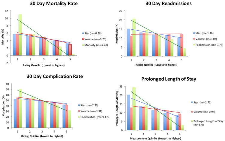
Figure 3. Comparison of goodness-of-fit lines for CMS' Hospital Compare Star rating and cancer surgery volume relative to actual measured outcomes.

m = slope of best-fit line
The bar graph presents the mean outcome by measurement quintile.The line is the best-fit line through the means. The slope of the line that is closest to the slope for the outcome measurement (green line) represents the better measure for predicting the outcome. A horizontal line signifies no association.
