Figure 2.

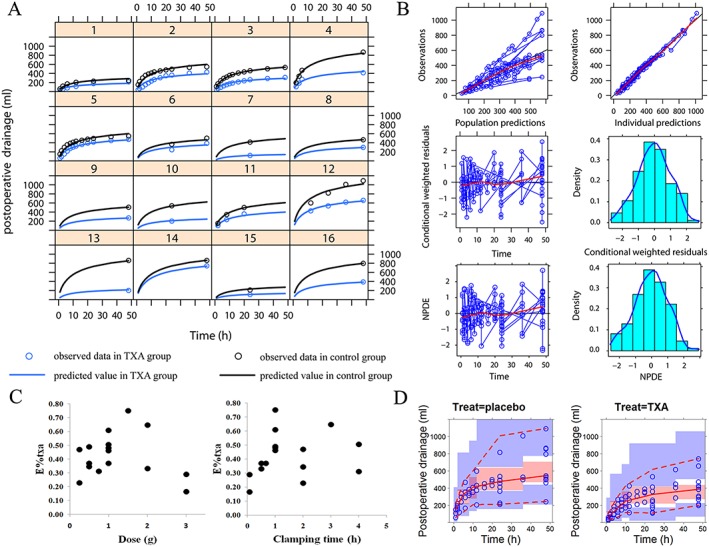
Model evaluation. (A) Time course of the postoperative drainage volume. The line represents the predicted value and the circle represents the observed value. The black represents the control group and the blue represents the tranexamic acid (TXA) group. (B) The goodness‐of‐fit plot. The upper left is the plot of population study prediction (PRED) vs. mean observation (DV). The upper right is the plot of individual study prediction (IPRED) vs. mean observation (DV). The middle left is the plot of conditional weighted residuals (CWRES) vs. time. The middle right is the plot of Density vs. CWRES. The lower left is the plot of normalized prediction distribution errors (NPDE) vs. time. The lower right is the plot of density vs. NPDE. (C) The correlation between the estimated E%txa and dose of TXA (left) and the correlation between the estimated E%txa and contact time (right). (D) Visual predictive check (VPC) of the model. The left is the VPC plot for control group and the right is the VPC plot for TXA group
