
Fig. 2.
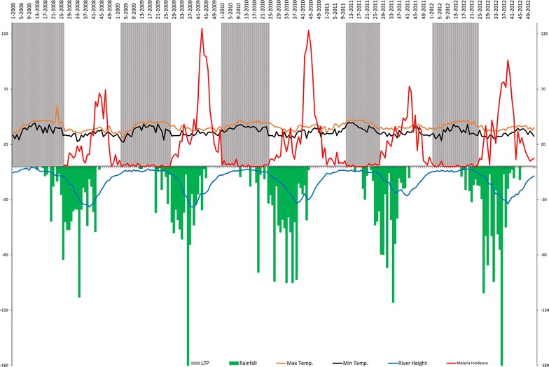
Malaria incidence time series, maximum temperature, minimum temperature, rainfalls and river height by week and by transmission period. The red line represents weekly malaria incidences, the orange and black lines represent respectively the weekly mean of maximum and minimum inside temperature (Mt1M; mt1m), the blue line represents the weekly mean of river height (rvh) and the green bar plot represents the weekly cumulative rainfall. The grey areas represent low transmission periods (LTP) according to the change point analysis