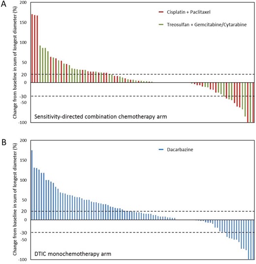
Figure 2. Waterfall plot depicting the best tumor response for each patient.

Data regarding the best tumor response are shown for 84 patients in the sensitivity-directed combination chemotherapy arm (A) and for 94 patients in the dacarbazine monochemotherapy arm (B), who had undergone at least one tumor assessment after study treatment. Each bar represents data for an individual patient. Colors indicate the treatment regimen received by the patients. The percent change from baseline in the sum of the longest diameters of the target lesions defined at study entry is shown on the y axis. Negative values indicate tumor shrinkage; positive values indicate tumor growth. The pointed lines indicate changes in diameters corresponding to partial response (-30%) and progressive disease (+20%), respectively.
