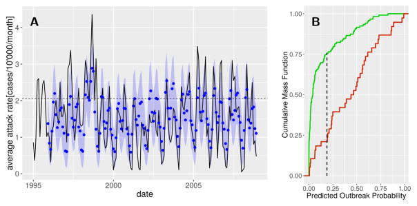
Figure 6.
Cholera outbreak prediction performance. (A) Eleven-month predictions of cholera incidence. The means (blue dots) and 95% confidence intervals (blue shadings) of the simulations are given together with the observed average city-wide cholera state (solid line). The outbreak threshold is indicated by the horizontal dashed line. (B) Kolmogorov-Smirnov test comparing the cumulative mass function of the predicted outbreak probability in months in which an outbreak did (green) and did not (red) occur. The point corresponding to the maximal distance between the two curves (vertical dashed line) is used as a threshold for outbreak prediction.

