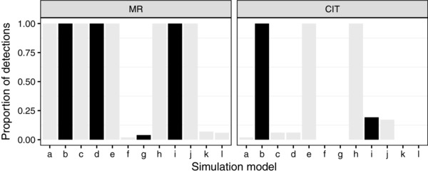
Figure 2.

Results of applying MR and the CIT to simulated data sets. The x‐axis represents the scenario from which the data were simulated. The y‐axis represents the proportion of time (the proportion of replicates where) a causal model was detected ( for MR, and with X the only link between G and Y, for the CIT). Black and grey represent true and false detections, respectively. For MR, we considered detections from simulated data sets with an arrow as true detections. For the CIT, we considered detections from simulated data sets with arrows but no additional link between G and Y as true detections
