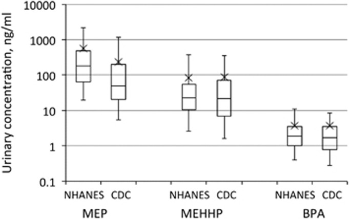
Figure 3.
Comparison of the distributions of spot sample concentrations for MEP, MEHHP, and BPA in the CDC serial sampling data set (“CDC”) to that from the NHANES survey in 2005–2006 for adults. The boxes represent the intraquartile range with the median as a horizontal line. Whiskers extend to the 5th and 95th percentiles, and the X indicates the arithmetic mean.

