Figure 5.
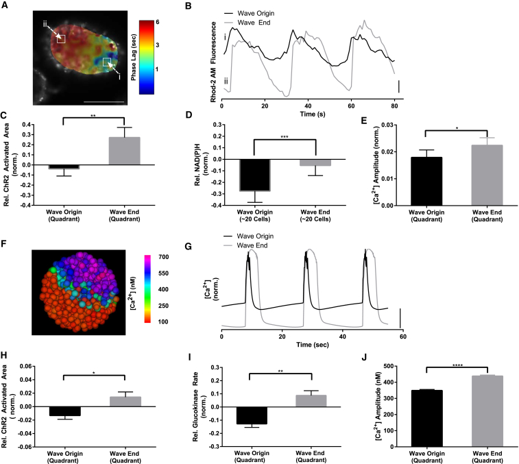
Calcium wave origin corresponds to less excitable and metabolically active regions. (A) A representative phase map of [Ca2+] oscillations within an islet at 11 mM glucose, as calculated through Fourier analysis, which indicates a wave emerging in region of minimum phase (dark blue) and terminating in a region of maximum phase (dark red). (B) Representative time-courses from (A), showing phase lag of [Ca2+] waves. (C) Mean ± SE ChR2-activated area of [Ca2+] relative to the islet average, in quadrant of wave origin and wave end. (D) Mean ± SE NAD(P)H response (between 5 and 11 mM glucose) relative to the islet average, in selected regions of minimum and maximum phase, as indicated in (A). (E) Mean ± SE [Ca2+] oscillation amplitude (normalized to average Rhod-2AM fluorescence) in quadrants of wave origin and wave end. (F) A representative false-color map of [Ca2+] wave in a simulated islet, as in (A). (G) Representative time-courses from (F), showing phase lag of [Ca2+] waves. (H) Mean ± SE ChR2-activated area in quadrants of wave origin and wave-end in simulated islet, as in (C). (I) Mean ± SE GK rate in quadrants of wave origin and wave-end in simulated islet, as in (D). (J) Mean ± SE [Ca2+] oscillation amplitude in quadrants of wave origin and wave-end in simulated islet, as in (E). Data in (C–E) were averaged over n = 16 islets from four mice. Data in (H–J) were averaged over n = 30 simulated islets. ∗ indicates p < 0.05, ∗∗ indicates p < 0.01, ∗∗∗ indicates p < 0.001, ∗∗∗∗ indicates p < 0.0001 comparing experimental groups indicated. Student t-test was used in (C–E), (H–J) to calculate statistical significance. Vertical scale bars indicate 2% change in fluorescence in experiment or 100 nM change in [Ca2+]i in simulated islets. Scale bar in (A) indicates 100 μm. To see this figure in color, go online.

