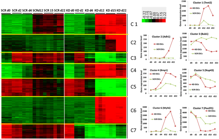
Figure 3.
Visualization of k-means clustering of differentially expressed probe sets with Euclidean distance measurement and k = 7 group clusters. Replicates are displayed in the vertical axis and genes in the horizontal axis. Log2 transformed signal intensities are depicted in colour code. The heatmap indicates high expression levels in red, intermediate expression level in dark grey and low expression levels in green. Representative diagrams for the gene expression pattern of the different clusters are shown on the right.

