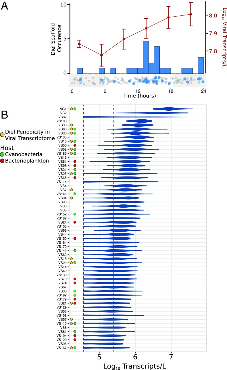
Fig. 2.
Diel timing and abundance of viral transcription. (A) The red line shows average transcripts per liter of total viral transcripts analyzed in this study, with error bars denoting SE. The histogram shows the peak time of aggregate viral transcripts for individual scaffolds, and the dotplot below it provides the peak times of all scaffolds, with significantly diel scaffolds in blue and all other scaffolds in gray. (B) Viral scaffolds abundant in the transcriptomes are shown on the y axis. The shape of the plot denotes the distribution of abundances recovered in all 44 time-points. The x axis shows transcripts per liter. The dotted red lines denote the upper and lower bounds of thresholds of detection. Colored dots next to the scaffolds denote putative host designations and scaffolds for which significantly diel transcription was determined.

