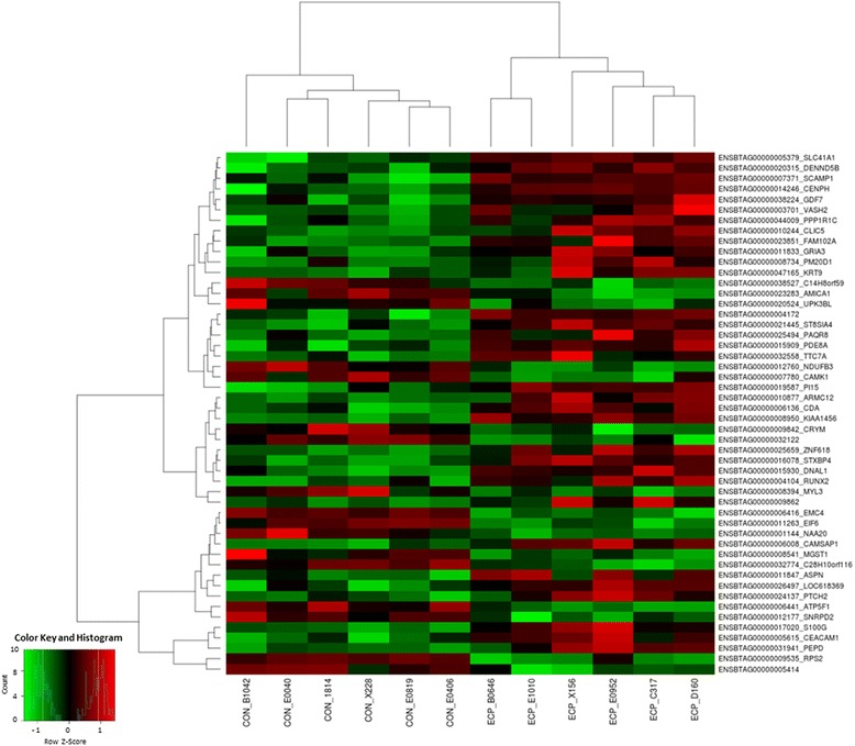
Fig. 3.

Heat map obtained from DESeq2 analysis. Each column represent one sample showing the intensity of expression profile per gene. The colors in the map display the relative standing of the reads count data; GREEN indicates a count value that is lower than the mean value of the row while red indicates higher than the mean. The shades of the color indicate distance from each data point to the mean value of the row
