
Figure 1.
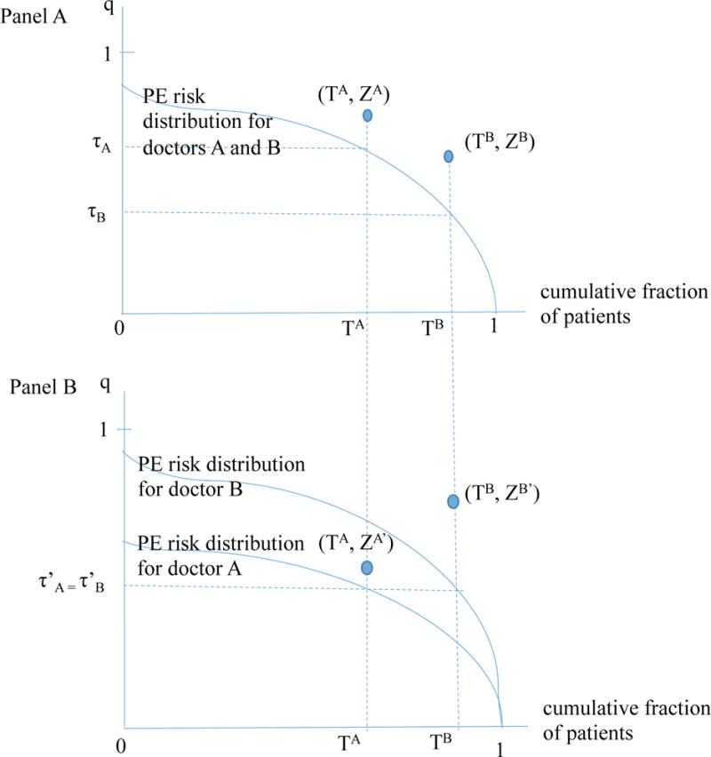
Stylized relationship between testing thresholds, testing rates, and test yields
Notes: Figure illustrates the theoretic relationship between testing thresholds, test yields and fraction of patients tested for two hypothetical doctors, A and B. Patients are sorted along the x-axis according to their risk of PE, qid, from highest risk to lowest risk. Each point (x, y) along the plotted curve shows the fraction of patients x for whom qid ≥ y. For example, at point (TA = 2/3, τA = 1/2) in Panel A, the graph indicates that 2/3 of patients have a risk of PE that equals or exceeds 1/2. τA denotes doctor A’s testing threshold, TA denotes the fraction of patients tested by doctor A, ZA denotes doctor A’s test yield (among tested patients), and likewise for doctor B. In Panel A, both doctors face patient populations with the same distribution of PE risk. In Panel B, Doctor B’s patients are higher risk, i.e. for any given probability of a positive test q, a greater fraction of doctor B’s patients meet or exceed that threshold compared to doctor A.