
Figure 3.
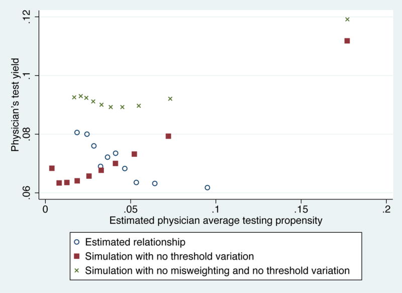
Binned scatterplot of physician test yield by testing propensity index: Estimation results and simulations
Notes: Figure displays a binned scatterplot based on our estimation and simulation results; physicians are binned into deciles based on the average estimated value of the testing propensity index . The open circle markers plots the relationship between physicians’ actual test yields and physicians’ average . Th solid square markers display the simulated relationship between testing propensities and test yields under a counterfactual with no variation in physician testing thresholds, and instead all physicians assigned the average testing threshold E(τd). The X-shaped markers displays the simulated relationship between testing propensities and test yields if there were no variation in physician testing thresholds and there were no misweighting of observable risk factors.