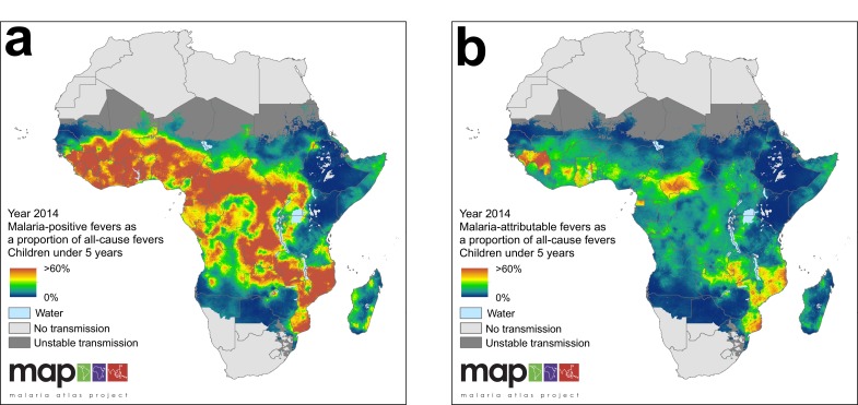
(
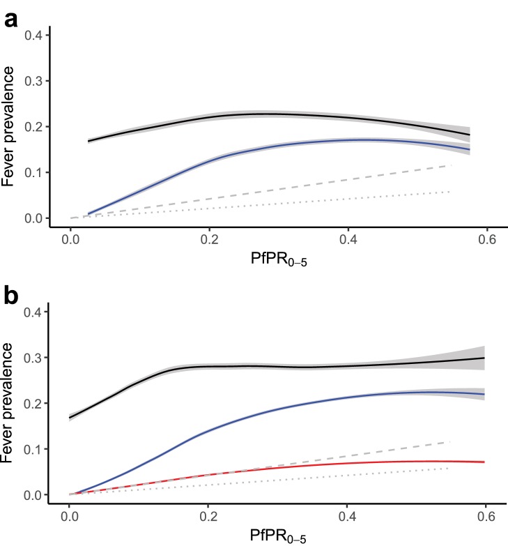
a) Response data relationship between all-cause fever (black line) and malaria-positive fevers (blue line), and predicted incidence (symptomatic illness) for the duration of the past two to four weeks (grey dashed line) and past zero to two weeks (grey dotted line)* with
PfPR0-5 from household survey datasets; and (
b) the modelled relationship between all-cause fever (black line), malaria-positive fevers (blue line), and malaria attributable fevers (red line), and predicted incidence in the past two to four weeks (grey dashed line) and past zero to two weeks (grey dotted line)* with
PfPR0-5 sampled from 10,000 pixels in predicted raster layers. Mean lines were fitted using locally-weighted regression, and shaded with 95% confidence intervals. *In both plots, the predicted incidence lines are generated from an ensemble of transmission models estimating the relationship between
P. falciparum prevalence and incidence, standardised to ages 0 to 4 years old (
Cameron et al., 2015). The grey dashed line depicts the estimated proportion of children in the past two to four weeks who had a clinical episode of malaria, and the grey dotted line depicts the estimated proportion of children in the past zero to two weeks who had a clinical episode of malaria, each with increasing
P. falciparum malaria prevalence. A good fit between predicted MAF and transmission model estimations of clinical incidence indicates our model has strong predictive performance.


