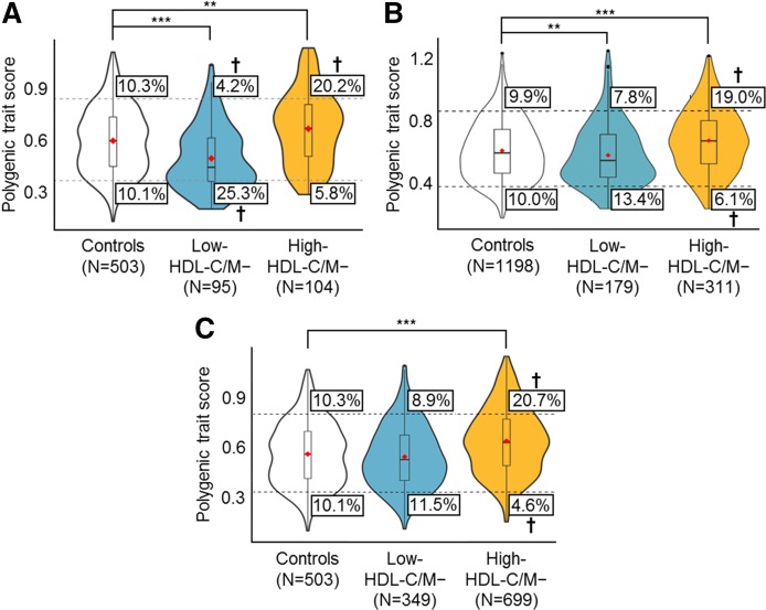
Fig. 2.
PTS analysis for low- and high-HDL-C/M− patients. Violin plots (similar to box plots, except that they also show the probability density of the data at different values) illustrate the distribution of polygenic scores for individuals in the control, low-HDL-C/M−, and high-HDL-C/M− groups in the Lipid Genetics Clinic cohort (A), the MHI Biobank cohort (B), and UPenn cohort (C). Red diamonds mark the mean PTS of the group. The total area of a single plot represents 100% of individuals in that group; wider sections of each plot represent an increased number of individuals with scores at that point, and narrower sections represent a decreased number of individuals. The top dashed line and bottom dashed line represent the threshold for the top 10th and bottom 10th percentiles of PTSs in the control population, respectively. The boxes indicate the percentage of individuals falling above or below the percentile thresholds. †Percentile groups with significant ORs (Tables 3, 4); **P < 0.01; ***P < 0.0001.

