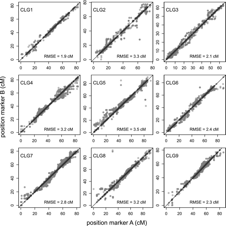
Fig. 6.

Scatterplot of marker positions of 1 × 0 markers on the integrated map that originated from the same transcript contig. Each dot represents a combination of markers that originated from the same transcript contig. The red dots indicate markers phased on the same homologue, gray dots on different homologues. The black line represents y = x (colour figure online)
