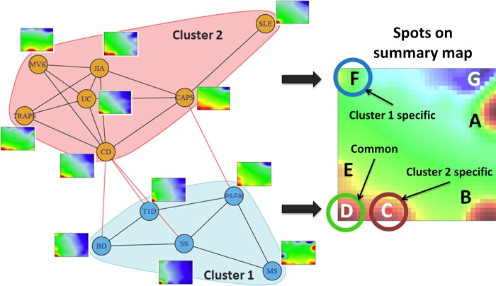
Fig 3. The spot-similarity graph of the diseases.
The nodes represent the diseases; the edges connect the disease portraits sharing the highest number of spots. The portraits are provided as thumbnails to each node. The graph is divided into the pink and the blue clusters using the walktrap community search algorithm, implemented in R package “igraph” [44].

