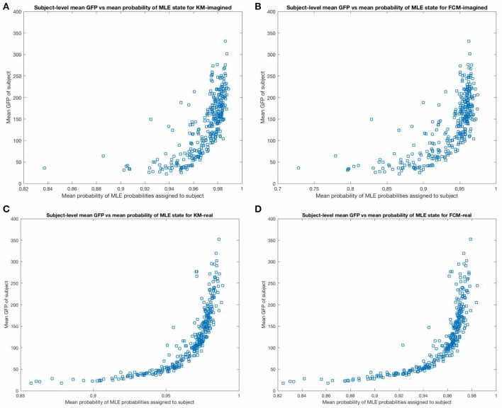
Figure 9.
The figure above shows the mean GFP (on the y-axis) vs. the mean probability of the maximum likelihood estimate state from the corresponding MLP (on the x-axis), across subjects. The top (A,B) show these for imagined motor movements and the bottom (C,D) show these for real motor movements. Note that the relationship is less noisy and stronger for the real motor movements for both FCM and KM. In particular, there are more subjects with significantly lower average certainty in the microstate assigned in the imagined models than in the real motor movement models. We excluded one outlier point from the top two sub-figures in the imagined motor movement data that had a mean GFP of close to 800, for a clearer comparison between the graphs.

