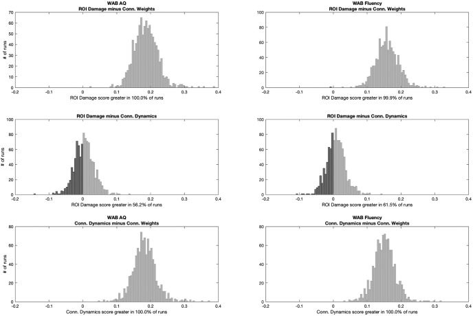
Figure 6.
Statistical analyses comparing the distribution of Pearson correlation coefficients between real and predicted dependent measures for each model. Each subplot demonstrates the distribution of the subtraction of the correlation coefficient from one method minus another. This is possible since the training and testing split samples were identical for each model at every iteration, providing a direct comparison between models. If 95% of the subtractions felt above 0, the first test in the subtraction was considered statistically superior than the other at p < 0.05.

