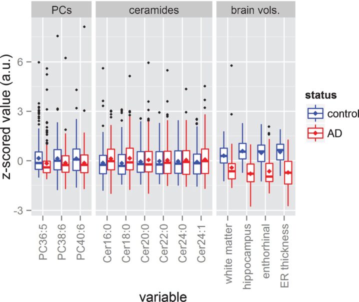
Fig.2.
Data distributions. The figure shows the box plots corresponding to each phosphatidylcholine (PC), each ceramide, and each brain volume. All variables have been z-scored to ease visual comparison. The sizes of the boxes represent the 25th and 75th percentiles, while the central horizontal line dividing both boxes represents the median, and the mean is represented as a rhomboid. The length of each whisker extends to 1.5 times the length of the box of its corresponding side. Samples beyond the length of the whiskers are represented as induvial black dots.

