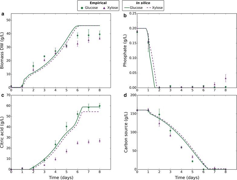
Fig. 4.

Comparing empirical and in silico data in response to different carbon sources. Markers represent empirical data and lines represent in silico data. Green circles and solid lines correspond to glucose. Purple triangles and dashed lines correspond to xylose. Empirical data plotted are the mean average of four biological replicates and error bars represent standard deviation. Citric acid data are normalised to reflect the amount produced. In silico data-points are one per minute. a Change in biomass dry weight (g/L) over time. b Change in external phosphate concentration (g/L) over time. c Change in external citric acid concentration (g/L) over time. d Change in external carbon source concentration (g/L) over time
