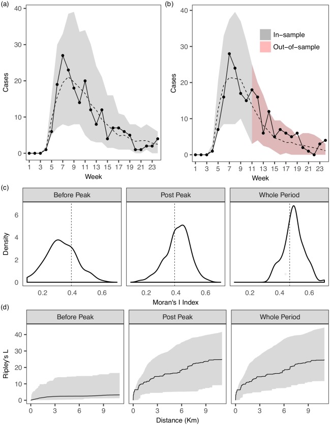
Fig 6. Posterior predictive distributions of temporal and spatial summary statistics of epidemics forward simulated from the estimated model.
(a) One-epidemic ahead in-sample model prediction. The observed epidemic is indicated by the dots and the line. 95% C.I. of the simulated epidemics at each week are indicated by the grey bands. Dashed line represents the median values of the simulated epidemics. (b) One-epidemic ahead in-sample and out-of-sample model prediction. We first estimate the model parameters using data from the first half of the epidemic duration (week 1 to week 11) and re-simulate from the estimated model from the beginning to the end of the epidemic duration (week 24). (c) Measure of global spatial autocorrelation using Moran’s I index (Refs. [7]) which ranges from -1 to 1 (a value close to 1 indicating strong clustering and close to -1 indicating strong dispersion), applied to epidemics before and after peak. The index corresponding to the observed epidemic is indicated by the dotted line. (d) Measure of clustering/dispersion using Ripley’s K, or its transformation Ripley’s L [40, 41]. Compared to global measures such as the Moran’s I, this function determines clustering/dispersion of point data over a range of distances (see S1 Text for more details), without requiring certain aggregation of the points, hence representing a more powerful and informative measure for our context. We consider and compute the L function using the the R package spatstat [42]. The measure corresponding to the observed epidemic is indicated by the solid line, along with the 95% C.I. of the simulated epidemics enclosed in the grey band. They indicate that the spatial clustering/dispersion of observed (point) data are captured reasonably well.

