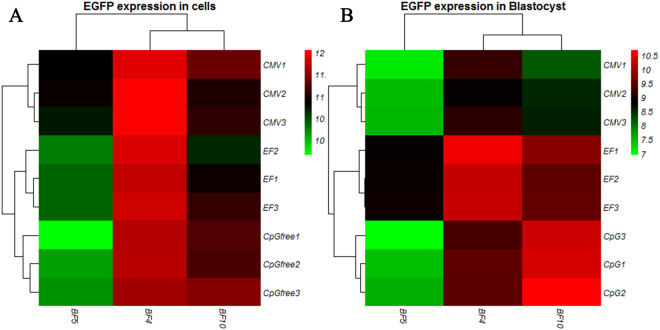
Figure 7.
Heat map generated from RT-qPCR data reflecting EGFP expression. EGFP expression was calculated for three promoters from three independent integration sites using custom R script (version 3.4.1). Columns indicate the expression changes at three different integration sites, while rows indicate different promoters for different clones. Color intensity is proportional to relative expressions for each integration site and each promoter, calculated by log2 N fold change for each clone. Red corresponds to high expression and green corresponds to low expression. EGFP expression data were analyzed by hierarchical clustering for both integration site and promoter. Hierarchical clustering reveals relation EGFP expression across groups. (A) Exhibiting different EGFP expression level by three promoters in different genomic sites of donor fibroblasts. (B) Exhibiting different EGFP expression level by three promoters in different genomic sites of blastocysts. In each data set, three biological replicates were used for each fibroblast clone and blastocyst group.

