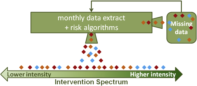
Figure 1.
Data and analysis work flow. This schematic demonstrates the application of the risk algorithm in practice. A regular data extract is coupled with the risk algorithm and persons with type 2 diabetes are assigned a composite risk score that places them on the intervention spectrum, from relatively low risk and lower-intensity, community-based interventions to relatively high risk and higher-intensity, individually-based interventions. Each diamond represents a patient; each color represents a different geographic area. In this representation, multiple persons at high risk characterize the blue neighborhood.

