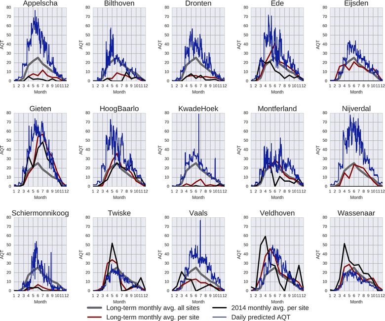
Fig. 6.

Daily predicted AQT for the locations of the flagging sites. Each subplot contains four curves: the long-term monthly average (grey) across all sites, the long-term monthly average for the flagging site (dark red), the 2014 monthly average for the flagging site (black), and the daily predicted AQT for 2014 yielded by RF (blue). Note that in 2014, the sampling stopped in Nijverdal and Eijsden
