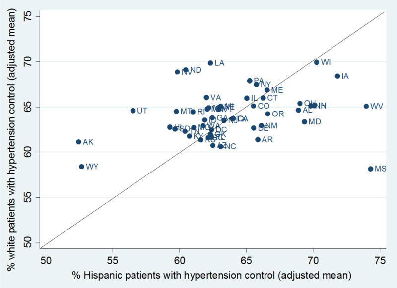
Figure 2. State Variation in Hypertension Control for White versus Hispanic Patients, 2010–2014.

As you move further up the y-axis, average hypertension control rates increase for white patients and as you move further down the x-axis, average hypertension control rates increase for Hispanic patients. A 45-agree angle line dissects the graph, where states close to or on the line exhibit no aggregate disparity between the two racial/ethnic groups; the further above the line a state appears, the larger the disparity in that state. Each state estimate represents the adjusted, population-weighted mean rate from 2010–2014 across all health centers in the state. All state estimates have p<0.001. All state estimates, including 95% confidence intervals, in addition to analogous figures for diabetes control and normal birthweight, are included in the Supplemental Digital Content (eTable 4, eTable 6, eTable 8).
