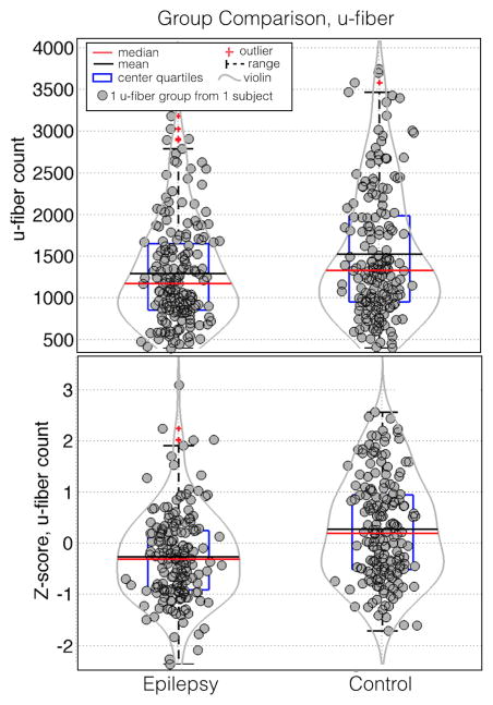
Figure 3.
Box and whisker plots of the z-score of the u-fiber count. Red horizontal lines indicate the median value of each distribution while the blue boxes delineate the 25th to 75th percentiles. Gaussian random shifts in the × direction are added to each data point to aide visualization. Violin plot overlays (gray curves) have been added to aide visualization of the density of points at each y position.

