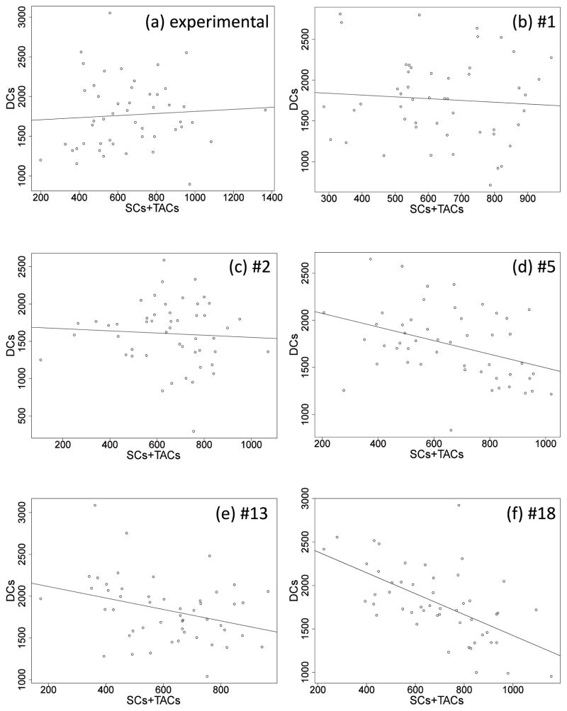
Figure 6.
The plots of DCs vs. the sum of SCs + TACs. (a) is for the experimental data, and p-value = 0.64 (linear correlation coefficient); (b) is for network 1 when q = 0.1, and p-value = 0.598; (c) is for network 2 when q = 0.1, and p-value = 0.661; (d) is for network 5 when q = 0.1, and p-value = 0.006; (e) is for network 13 when q = 0.2, and p-value = 0.021; (f) is for network 18 when q = 0.3, and p-value = 4.89× 10⁻⁶. The straight lines indicate the fitted regression line for each. Please note that different values of q are used in the subfigures (b–f) because different networks describe the measured mean and variances for different subsets of the possible q values.

