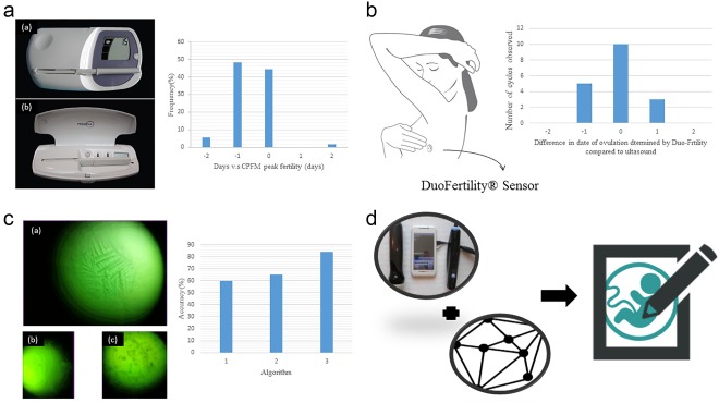
Figure 3.

(a) The left graph is the photo of Clearblue Easy Fertility Monitor (a) and the Persona (b).60 The right bar chart is the Serum LH surge relative to CPFM peak fertility. The X‐axis −2 and 2 represents >1 day before or after CPFM peak fertility, respectively. Cycles with no CPFM peak fertility (n = 13), no serum LH surge day (n = 10), or neither (n = 1) are excluded from the table.61 (b) The left graph is the illustration of DuoFertility® Sensor worn by patients. The right bar chart is the correlation between ultrasound scans and DuoFertility® result.62 (c) The left graph is the result of ferning patterns by Knowhen Ovulation Monitoring System. (a) Fertile (b) preovulatory (c) postovulatory.63 The accuracy of three proposed algorithms. Algorithm 1 is binarizing + dark pixel density. Algorithm 2 is binarizing + dark pixel density + thinning. Algorithm 3 is binarizing + Hough transform + thinning + decision tree.64 (d) The illustration of possible combination of smartphone ultrasound device and imaging processing algorithms as an ovulation detection device65
