
Figure 6.
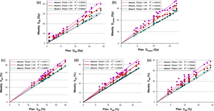
Correlations for the weekly (a) D50, (b) Dmean, (c) V20, (d) V30, and (e) V40 of liver for plans calculated using pCT and weekly mCBCT. Dots above the line y = x (indicated by the black line) are reconstructed increases, dots below the line are reconstructed decreases. The slopes of the linearly fitted lines for D50, Dmean, V20, V30, and V40 were computed and given in the top left of the plot, and the trend is measured here using the slope value.