
Figure 8.
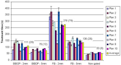
Average treatment time per plan. The overall average for all plans is displayed in yellow with its value in seconds on the graph (the SD is shown in brackets).
Official websites use .gov
A
.gov website belongs to an official
government organization in the United States.
Secure .gov websites use HTTPS
A lock (
) or https:// means you've safely
connected to the .gov website. Share sensitive
information only on official, secure websites.
Average treatment time per plan. The overall average for all plans is displayed in yellow with its value in seconds on the graph (the SD is shown in brackets).