Figure 3.

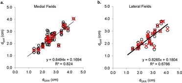
Scatter plots of vs. , calculated from medial (a) and lateral (b) fields. Open circle (O) represents a comparison from one fraction. Red crosses (x) represent the average of all fractions for an individual patient.

Scatter plots of vs. , calculated from medial (a) and lateral (b) fields. Open circle (O) represents a comparison from one fraction. Red crosses (x) represent the average of all fractions for an individual patient.