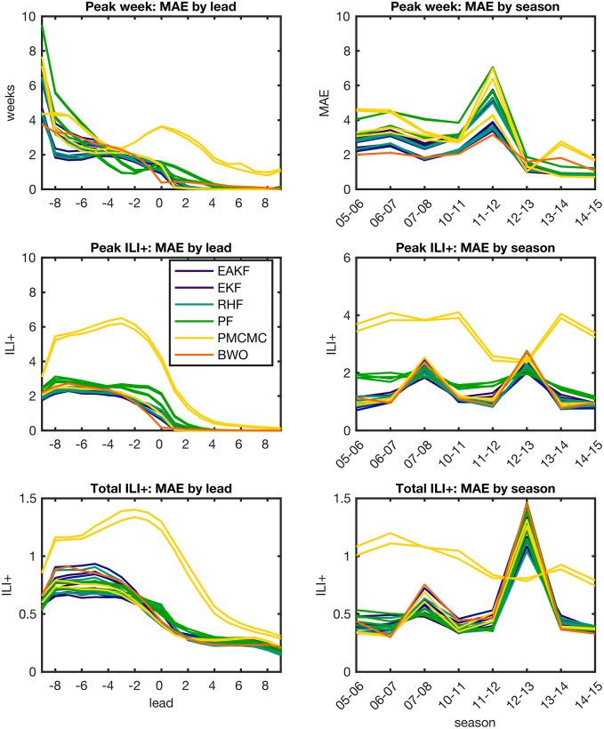
Fig 3. Forecast MAE grouped by forecast lead (left column) and season (right column).
Line plots show MAE for forecast peak week (top row), peak ILI+ (middle row) and total ILI+ (bottom row), averaged over all locations. Each line shows the MAE of an individual forecast method. For the model-filter systems, colors indicate groupings by filter type.

