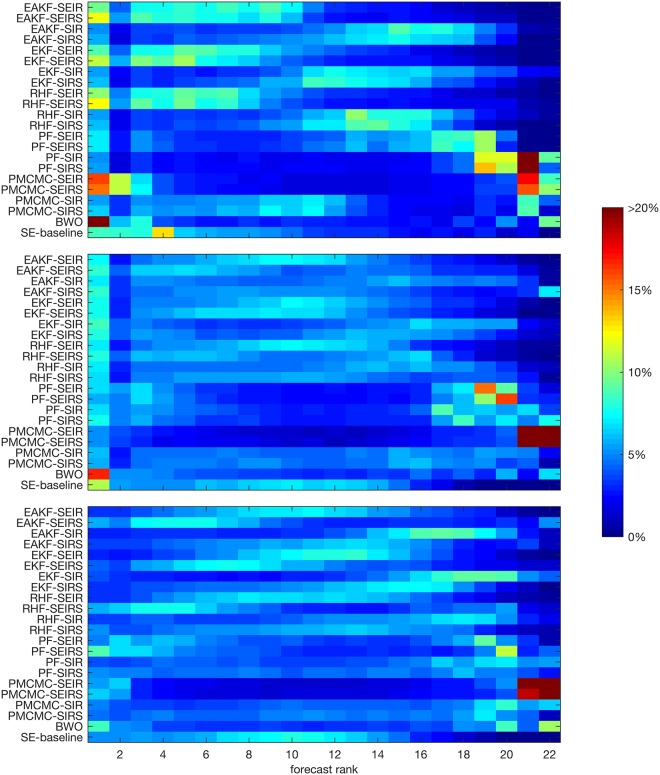
Fig 6. Heat map of forecast rankings.
The colors indicate the frequency of each forecast ranking, with rank 1 assigned to the most accurate forecast and rank 22 assigned to the least accurate forecast. More optimal forecasts have a higher frequency of top rankings (warm colors on the left) and a lower frequency of bottom rankings (cold colors on the right). The upper image shows peak week, the middle shows peak incidence, and the bottom shows total incidence. This analysis includes all forecasts of total season incidence (n = 22640), and all forecasts made at or prior to the observed outbreak peak for peak week and peak incidence (n = 15187). Forecasts made after the peak had been observed were excluded from the ranking, as were forecasts where all 22 forecasts predicted the same outcome.

