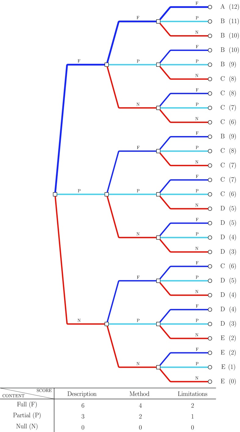
Fig. 2.
Diagram representation for the quality score categories. The table at the bottom shows how scores have been weighted according to the information provided on each component. In accordance with the table, different branches of the diagram correspond to different components. From left to right, the initial branches are related to the description, branches in the middle to the method, and final branches to the limitations. The branches’ colour represents the different way the information provided in each analysis component is evaluated: red no information (N), light blue partial information (P), blue full information (F). Final scores (0–12) with associated ordered categories (E–A) show the overall level of information provided for each combination of component and content evaluation

