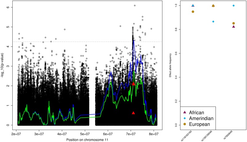
Fig 2. The MAP Amerindian admixture mapping region on chromosome 11.
The left provides the admixture mapping results as two lines, with the blue line that crosses the genome-wide significance threshold (horizontal grey dashed line) representing results from the primary analysis and the other, green line, representing the results from the conditional analysis, and the association results in the same region as circles. Lines and points are given as -log(p-value, 10) against genomic positions. Filled triangles correspond to the SNPs used in the conditional analysis. The right panel provides the ancestry-specific effect allele frequencies (EAF) for each of the SNPs used in the conditional analysis, as estimated by ASAFE applied on the HCHS/SOL data set [30].

