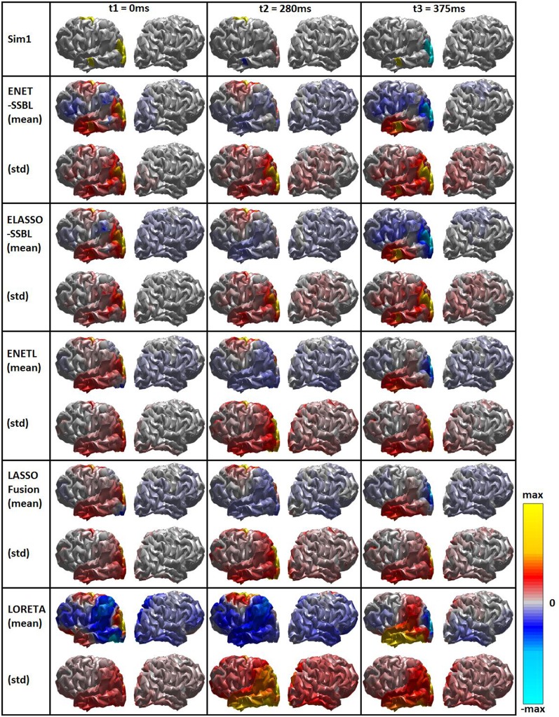
Figure 6.
Simulated (first row) and estimated spatial maps with the different inverse methods. Each rectangle shows the mean (Upper part) and the standard deviation (Lower part) maps across 100 trials for the first simulated configuration (Sim1), at the three time points of interest corresponding to different sparsity scenarios. Bipolar color map shows the solution within a window of ± the maximum absolute value, gray color corresponds to zero values. A logarithmic scale has been set for a better visualization.

