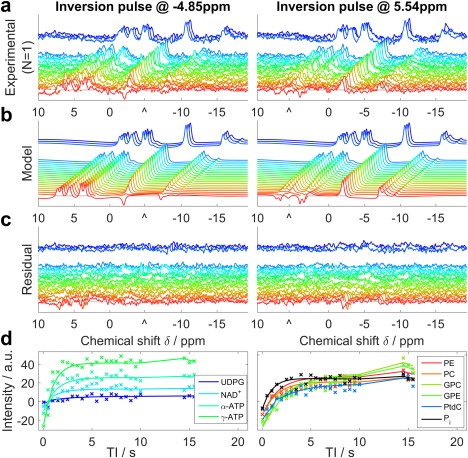
Figure 3.

Illustration of 31P Look‐Locker CSI fitting for a typical set of liver data. a: Raw spectra from a single voxel of a single subject. Each line shows a different TI, with a gap to indicate the break for magnetization recovery in the pulse sequence. b: The model spectra that were fitted simultaneously to the experimental data. c: The residual error after fitting. a–c: Images are plotted with the same scaling. “^” marks the central frequency of the inversion pulse. d: The absolute intensity sampled at the fitted frequency of each metabolite. Each “x” marks an experimental TI, and the lines show the simulated data. These panels are drawn to help interpret the spectra in a–c, but were not used in the T1 analysis.
