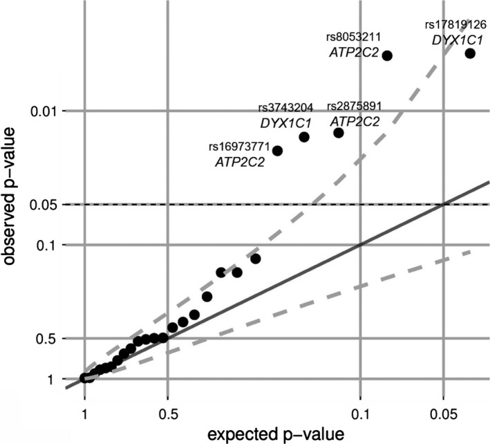
Figure 2.

QQ‐plot of association analysis. The QQ‐plot displays the relation of the expected and the observed p‐value distribution for the 25 independent single‐nucleotide polymorphisms. The dashed line represents the 95% confidence interval revealing association stronger than expected due to multiple testing
