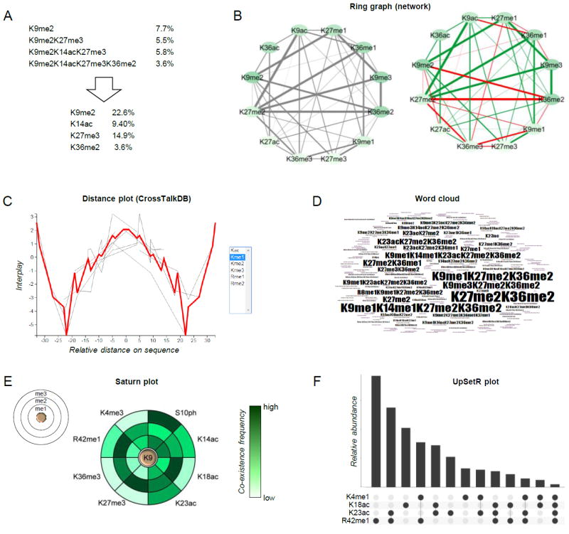
Figure 4. Examples of graphical representation of combinatorial PTMs.

(A) Schematic showing how quantitative values of combinatorial PTMs can be deconvoluted into single mark abundance. Briefly, the total relative abundance of individual mark is the sum of the relative abundance of all modified forms containing the given mark. (B) Representation of co-existence frequency of PTMs using a ring graph layout. Line thickness indicates higher frequency; line coloring displays the interplay between two marks (green: positive, red: negative) [65]. (C) Distance plot and (D) word cloud, tools of CrossTalkDB [66]. (E) Saturn plot [70], which displays the co-existence frequencies of a modified residue together with others (on the rings). (F) UpSetR plot [71], an alternative to the Venn diagram for displaying co-existence frequencies of multiple PTMs.
