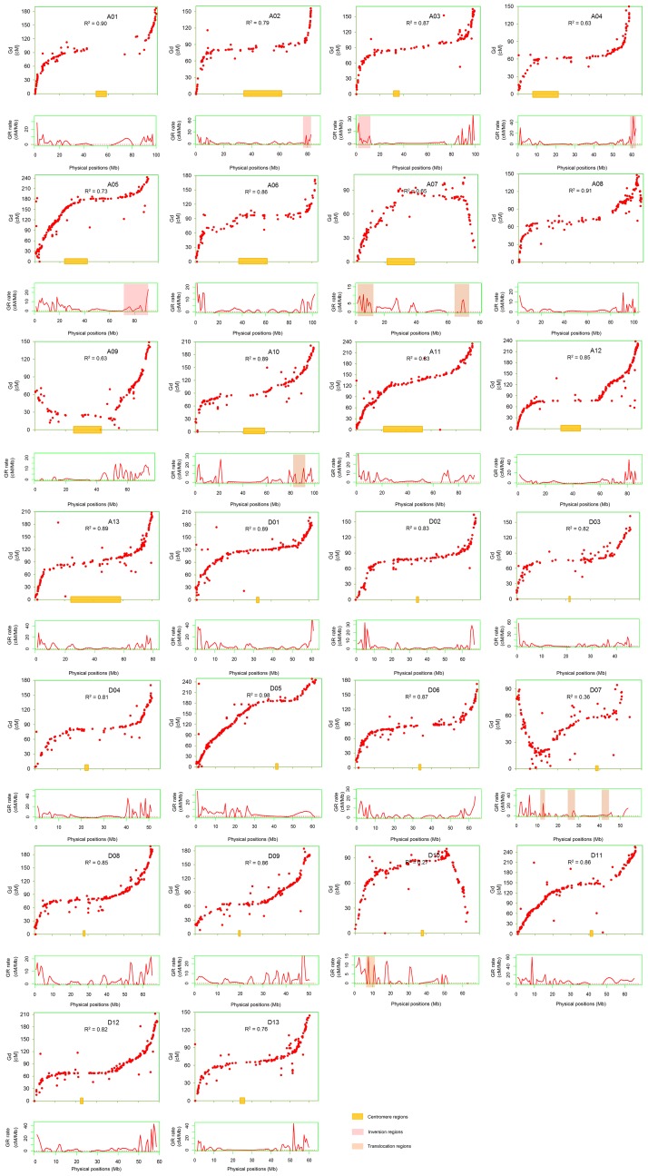
Fig 2. The correlation of genetic and physical maps, the estimated local recombination rates and its distribution in chromosomal rearrangement regions.
The red dots represent the genetic and physical positions of markers. The red curves below the scatter plots of SSRs represent the estimated local recombination rates. The value of R2 represent the correlation between the genetic and physical maps. Shadow represents the centromere regions, inversion regions and translocation regions.

