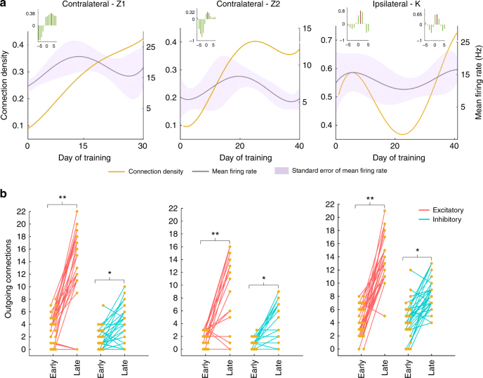
Fig. 5.
Relationship between connectivity and firing rate. a shows the mean firing rate (gray line; the standard error is shown as shaded region) along with the overall connectivity (yellow line). Inset shows the cross-correlation between mean firing rate and the normalized connectivity. The peak correlation is marked in red line. b Connection density projecting out of each neuron (i.e., out-degree density) during an early pooled data set and a late learning day is shown. The early pooled and late data sets had comparable spike counts. Each point corresponds to the number of out-degree connections of a single neuron. Red and blue lines connect excitatory and inhibitory out-degree densities, respectively. (Paired t-test, **p < 0.01, *p < 0.05)

