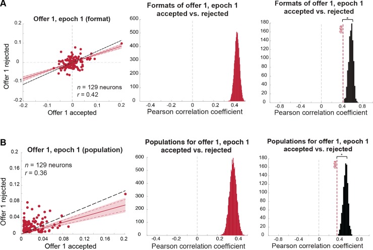
Fig 3. Coding format for offer 1 in the first epoch is similar, regardless of whether it will be accepted or rejected, yet also weakly depends on the upcoming decision.
Results also hold when the outlier cell is removed. (A) Format analysis: (left) scatterplot of offer 1/epoch 1 regression coefficients for trials in which offer 1 is accepted (horizontal axis) versus rejected (vertical axis). Shaded error region indicates 99% credible interval, and dashed red lines indicate the 95% credible interval. The black dashed line indicates the level of correlation we would expect to see under a chance model (see main text and Materials and methods). (Middle) distribution of mean correlation coefficient of data. The mean of this distribution is represented as a red dashed line in the right panel. (Right) distribution of mean correlation coefficients expected under a chance model (black distribution) compared to the mean correlation observed in the data (red dashed line; permutation test with 1,000 permutations: p < 0.001). (B) Population analysis: (left) scatterplot of offer 1/epoch 1 absolute regression coefficients for trials in which offer 1 is accepted (horizontal axis) versus rejected (vertical axis). Shaded error region indicates 99% credible interval, and dashed red lines indicate the 95% credible interval. The black dashed line indicates the level of correlation we would expect to see under a chance model (see main text and Materials and methods). (Middle) distribution of mean correlation coefficient of data. The mean of this distribution is represented as a red dashed line in the right panel. (Right) distribution of the mean correlation coefficients expected under a chance model (black distribution) compared to the mean correlation observed in the data (red dashed line; permutation test with 1,000 permutations: p < 0.001). Data used to generate these plots can be found at https://doi.org/10.5061/dryad.h52f8.

