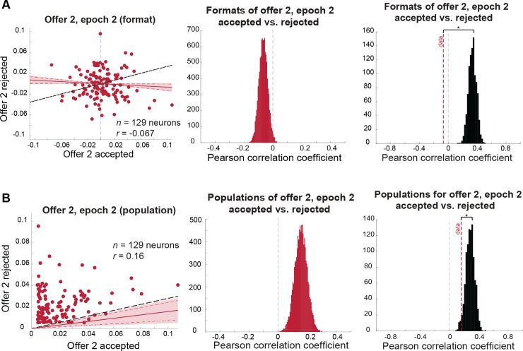
Fig 6. Coding of offer 2 in the comparison epoch is dependent on the upcoming decision (for statistical comparison between format correlations, see Fig 5).
Red lines indicate mean correlation, red shaded area indicates 99% credible intervals, red dashed lines indicate 95% credible intervals, and black dashed line indicates the correlation expected under a chance model. (A) Format analysis: (left) scatterplot of offer 2, epoch 2 regression coefficients for trials in which offer 2 is accepted (horizontal axis) versus rejected (vertical axis). (Middle) distribution of mean correlation coefficient of data. The mean of this distribution is represented as a red dashed line in the right panel. (Right) distribution of mean correlation coefficients expected under a chance model (black distribution) compared to the mean correlation observed in the data (red dashed line; permutation test with 1,000 permutations: p < 0.001). (B) Population analysis: (left) scatterplot of offer 2, epoch 2 absolute regression coefficients for trials in which offer 2 is accepted (horizontal axis) versus rejected (vertical axis). Shaded error region indicates 99% credible interval and dashed red lines indicate the 95% credible interval. The black dashed line indicates the level of correlation we would expect to see under a chance model (see main text and Materials and methods). (Middle) distribution of mean correlation coefficient of data. The mean of this distribution is represented as a red dashed line in the right panel. (Right) distribution of mean correlation coefficients expected under a chance model (black distribution) compared to the mean correlation observed in the data (red dashed line; permutation test with 1,000 permutations: p = 0.026). Data used to generate these plots can be found at https://doi.org/10.5061/dryad.h52f8.

