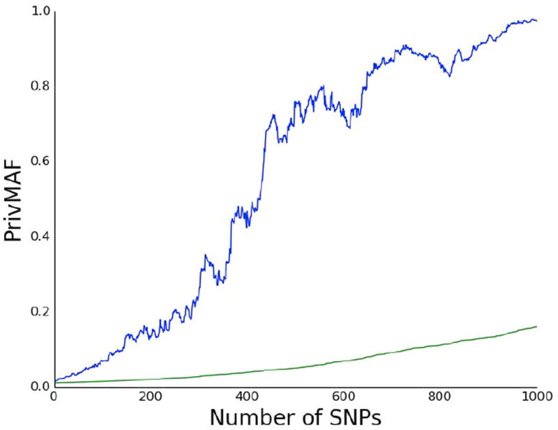
Figure 3.
Worst Case Versus Average Case PrivMAF. Graph of the number of SNPs, denoted m, versus PrivMAF. The blue curve is the maximum value of PrivMAF(d,MAF(D)) taken over all d ∈ D for a set of n = 1, 000 randomly chosen participants in the British Birth Cohort, while the green curve is the average value of PrivMAF(d,MAF(D)) in the same set. The the maximum value of PrivMAF far exceeds the average. By the time m = 1000 it is almost five times larger.

