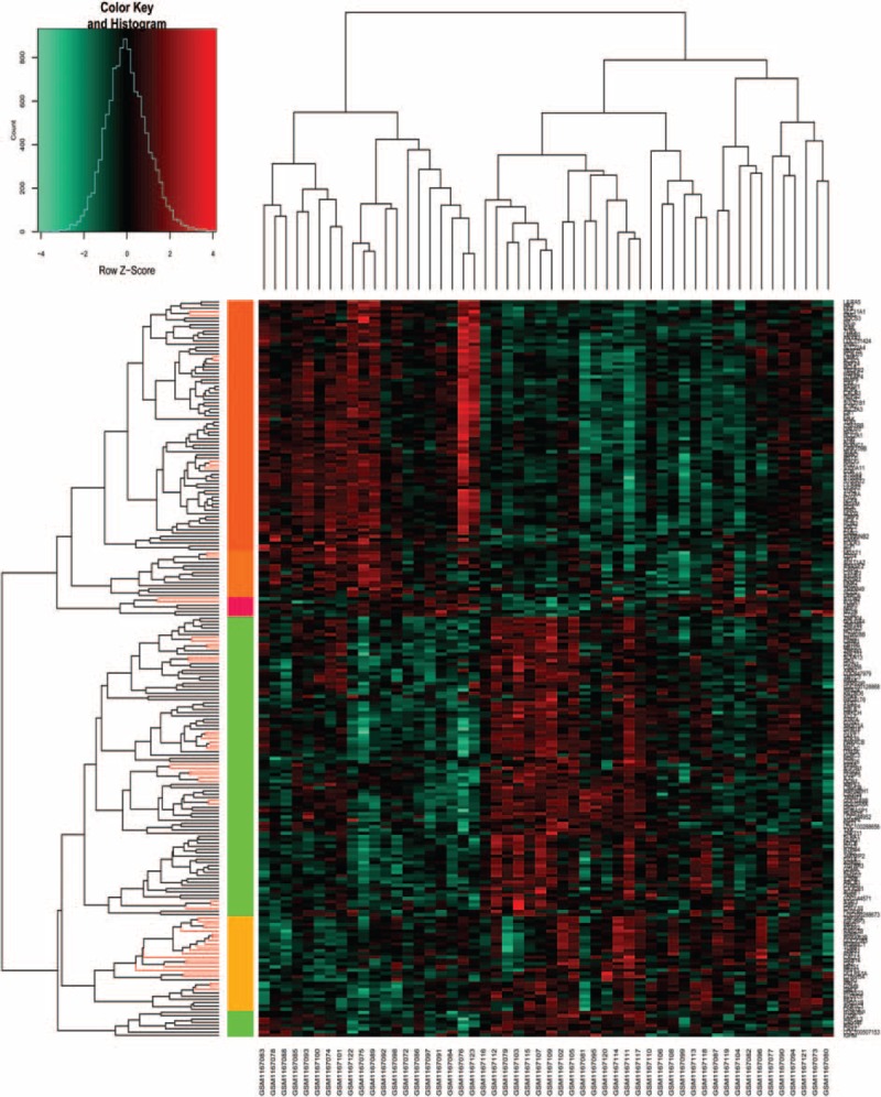
Figure 1.

Heat map of clustering analysis of the gene expressions. X-axis represents the names of each sample in dataset GSE48060, and Y-axis represents the clusters of genes. The color toward red represents high expression values, and color toward green represents lower expression values.
