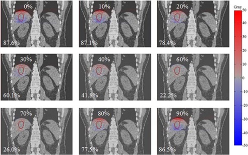
Figure 3.

An example of dose‐difference maps between warped doses from each phase (0% to 90%) and the reference phase dose for Lesion D. The percentage in the bottom‐left corner of each figure indicates the maximum point dose difference inside the liver. Hot (red) and cold (blue) spots indicate positive and negative differences, respectively.
