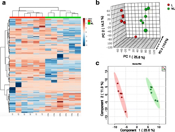
Fig. 3.

Heatmap, 3-D principal component analysis (PCA) score map and 2-D partial least squares discriminant analysis (PLS-DA) score map of the mammary gland tissue from 6 lactating cows and 6 non-lactating cows. Subgraph a, b and c represent the Heatmap, PCA, and PLS-DA, respectively. Red and green color bars represent lactating and non-lactating cows, respectively. The blue boxes indicate an expression ratio that is less than the mean, and the red boxes denote an expression ratio that is greater than the mean. The darker the color is, the larger the difference there is from the mean value
